YUMMY UNITED is an international food company that makes products for children. We want every child to really like our products, that's why we give children the opportunity to influence what we produce for them.
We are


The overall look&feel is cheerful and emotional.
Active bright colors, dynamic composition.
IMPORTANT: despite the active dynamic visual language, the style is concise and communicative, there are no unnecessary elements, everything is in its place. Bright, modern, concise, flat, creative.
Active bright colors, dynamic composition.
IMPORTANT: despite the active dynamic visual language, the style is concise and communicative, there are no unnecessary elements, everything is in its place. Bright, modern, concise, flat, creative.
Identity
Общий look&feel жизнерадостный и эмоциональный. Активные яркие цвета, динамичная композиция.
ВАЖНО: не смотря на активный динамичный визуальный язык, стиль лаконичный и коммуникативный, нет лишних элементов, все на своих местах. Ярко, современно, лаконично, плоско, креативно.
ВАЖНО: не смотря на активный динамичный визуальный язык, стиль лаконичный и коммуникативный, нет лишних элементов, все на своих местах. Ярко, современно, лаконично, плоско, креативно.


Logo
The YU logo consists of a unique grapheme, complete with a smile symbol and an overall circular shape with full title.
Inside the black part of the logo there is an imitation of a craft texture.
Inside the black part of the logo there is an imitation of a craft texture.
Main version
Inversion

Additional possible logo color scheme principles


The main principle of the color scheme of the YU Logo is to be bright, modern, contrasting.
Мascot
Yeti is the brand hero and symbol of the company. Personality: kind, playful, understandable.
Stylistically executed
in a concise manner, flat graphics. A minimum of elements in the image, a maximum in emotions.
Stylistically executed
in a concise manner, flat graphics. A minimum of elements in the image, a maximum in emotions.
Character development
Modern, bright and contrasting
Colours
Yummy green
#73BC25
#f69e04
#00abe7
#d41367
#E7314B
#e84a05
#27B5B5
#9b90c5
#c00231
Yummy space
#ffffff
#0c0c0c
#55539c
#00a46c
#68b5e3
#77003c
#8b2786
#fedfb2
#f29caf
Typography

Intro Head B
G Base
G Base


Intro Head B
Base
Base
Circe
Bold
Bold

Tomarik
Brush
Brush
Illustration


Lively emotional flat illustration with a slight pseudo-volume. Minor craft wear allowed


The packaging decision, depending on the category, may slightly change the level of detail of the heroes.
A lively emotional flat illustration with a more active pseudo-volume.
A lively emotional flat illustration with a more active pseudo-volume.


Photo style
Atmospheric photo style in the style of a reportage. Interesting non-standard plans and angles. The feeling is not staged, authentic "caught moment". More used for business communications.


Photo style
Photo style collage. Always mixed by typography and illustration. More used for communication with children.


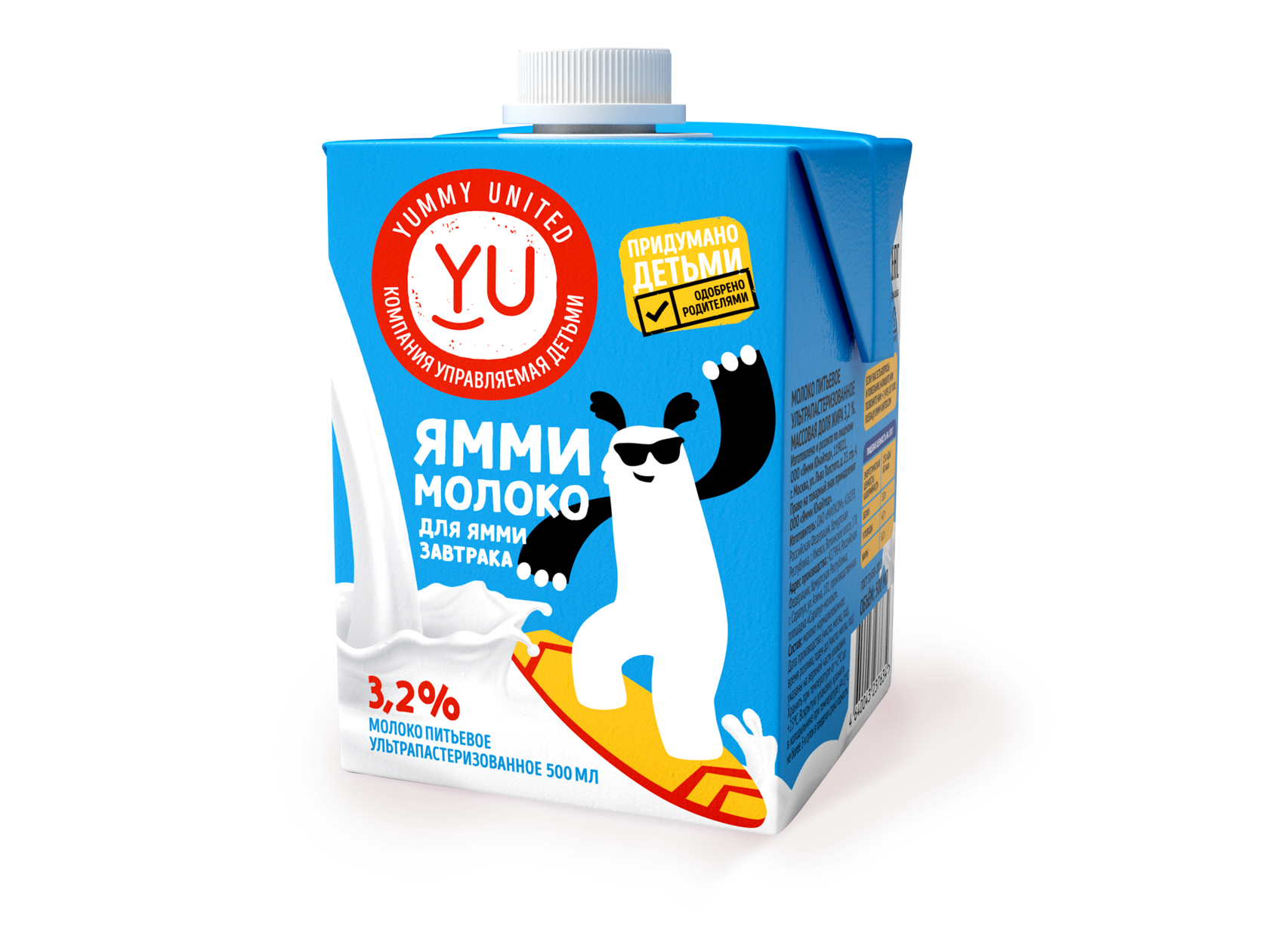
Bright laconic style, nothing superfluous, no visual noise. All products are created according to the ideas of kids.
Products and apps


Milk shakes
Breakfasts


Juices


Glazed bars


Mobile applications


POS materials are designed in the same YU style. Bright laconic style, nothing superfluous, no visual noise.
Point of sale
Dont's


Recolor the logo in non-contrasting, not bright, not pure colors
Warp the logo
Recolor the body of the Yeti in any color other than white
Use boring modular layout and plots without a creative idea. Excessive use of photostocks.
Use a large number of elements, complicated design
Create an aggressive, disturbing look&feel


Watercolour
Black and white graphics
Digital illustration


Ul. Butirsky Val, 10, floor 6, room
06-158, Moscow, Russia, 125047
06-158, Moscow, Russia, 125047